This is something I've been meaning to do for months now. Decided to give painting like Jim Wappel a go.
%2B(800x784).jpg)
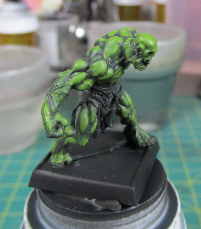
JJ painting, many of us are familiar with James Wappel and his fantastic painting ability. Would've loved to get into his kickstarter but always spent the money elsewhere. Hope to purchase all the discs someday. That day will be far in the future. Til then I'll learn from visiting his sites, there are little things that catch my eye. Piece by piece I'm starting to put together his technique. Through pics and videos, his replies to my comments and something special (more on that in a future post) I felt fairly confident it was time to try his technique. Originally wanted to do it with one of Suijin's priests for his Sisters army. However, my character in Friday night Pathfinder game is a female Half-Orc Monk. My brother Bryan said I can use his Orc mini. Been using it in the game and holding onto to it for a couple of weeks. When he handed it to me he asked if I was good at painting scars and tattoos, said yes. Well, only after starting to make this post did I remember the scars and tattoos, oops.
This is my first time painting like Jim so please be kind.
Enjoy
%2B(800x600).jpg) |
| Taking Jim's advice literally here's my pallet of colours. |
%2B(622x612).jpg) |
| Undercoat airbrush Army Painter Mat Black. |
%2B(800x600).jpg) |
| If I'm going to try to paint like Jim it'd be best to use his techniques as much as possible. |
%2B(800x600).jpg) |
| Don't have the same brushes as he does. Will use his technique my weapon of choice. |
%2B(800x598).jpg) |
| Of all the information Jim shared this made no sense until the other day. Then something clicked and it made sense. |
%2B(800x599).jpg) |
| Flash Gitz yellow |
%2B(800x599).jpg) |
| Nurgling Green |
%2B(800x599).jpg) |
| Vallejo Model Air Field Green |
%2B(800x599).jpg) |
| Reaper Dusky Skin Shadow and Vallejo Model Air Blue. This was the result of pulling paint from the pots and pallet and rinsing the mixing brush. |
%2B(800x599).jpg) |
| Doh! Forgot clean water. This will be important. |
%2B(800x600).jpg) |
| Colours on the pallet. Like Jim. |
%2B(800x600).jpg) |
| Time to make them into glazes. Don't usually paint with glazes. Will probably take me several more times before glazes make sense. Like Jim went by feel, no ratios. Some needed less water, others needed more. |
%2B(800x600).jpg) |
| Starting to mix the colours. Mixed Reaper Dusky Skin Shadow and Vallejo Model Air Field Green for basing. |
%2B(680x731).jpg) |
| Based with Dusky Skin shadow and Field Green. |
%2B(745x760).jpg) |
| Because its a glaze it is rather easy to flow around the model. The paint moves into the crevices easily. |
%2B(800x600).jpg) |
| Now to start mixing the paint to start the highlighting. Some Field Green and Flash Gitz Yellow. |
%2B(779x800).jpg) |
| Woah! Who turned on the light bulb? Way too bright. This would be ideal for a finishing highlight. |
%2B(700x800).jpg) |
| Then it occurred to me. Great time to do what Jim said in a comment months ago. Specifically it was about his space themes and building up with glazes. He said if you go bright may have to go back to darken it. Turned out better that the first highlight was too bright because it allowed me to remember, try what he was talking about and learn more about his ability. |
%2B(800x600).jpg) |
| Probably like Jim there was no do-over. Kept the first highlight colour and added more field green to it. Now it was looking better. |
%2B(800x600).jpg) |
| Not quite right though. Now to add some Flash Gitz Yellow, going back and forth like Jim said. |
%2B(749x800).jpg) |
| Ah, much better. You see one of Jim's techniques on the model. Using the base colour in the brush when adding the new colour starting from the feet, where the light will be covered, working to the top of the model where the the highlight really starts to be noticed. |
%2B(717x800).jpg) |
| Added more Flash Gitz yellow and started with another highlight. This time picking out specific areas. |
%2B(800x599).jpg) |
| Water is looking better and better everytime. Perhaps too grey, still works though. |
%2B(736x800).jpg) |
| It is at this point I was painting to fast, moving from colour to colour increasing the highlights and depths to remember to take pictures. Some areas were hit with a "highlight" of a darker green between the muscles, while building the existing highlights by adding more yellow. Finally time to use that blue. Started working on the waist clothe. |
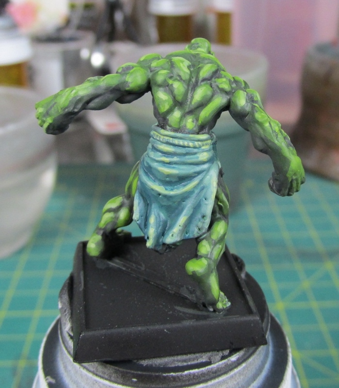%2B(699x800).jpg) |
| Mixture of Vallejo Model Air Blue with some Nurgling Green. Then adding more Nurgling Green to the mixture and only hitting extreme parts of the clothe. |
%2B(712x800).jpg) |
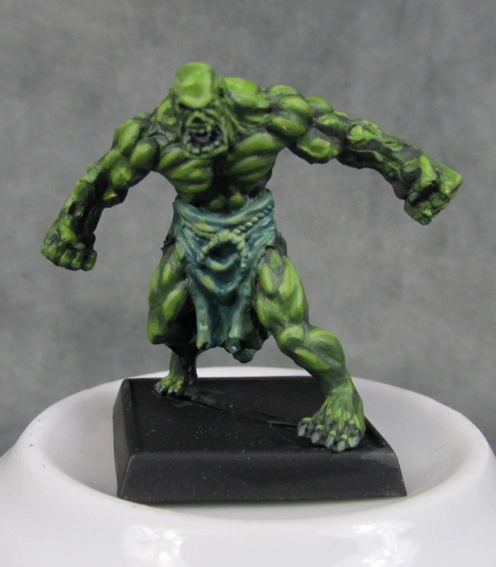
| Mix of Nurgling Green and very little skin highlight for the teeth and nails. Worked more and more with the clothe to get the fade and highlights how I wanted it. Looking at my ipod and was amazed. Started this model late and expected to work on it all night. Nope, 51 short minutes later and it was done! Wow, was I surprised. Using the same technique I can make some decent money with my commissions. |
%2B(800x600).jpg) |
| Here's the mess of the pallet. Surprised how orderly it looks. Next time, that mother will be wrecked! |
%2B(800x599).jpg) |
| Time for the magic that Andrew and Jim mentioned. Here's my wash to finish the model. |
%2B(700x800).jpg) |
| Will be buying a plinth soon. |
%2B(734x784).jpg) |
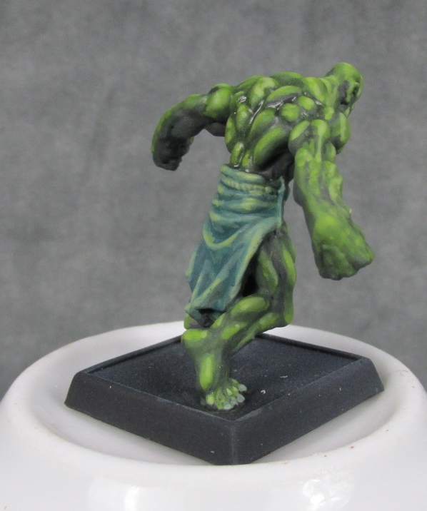
| Since this will be used in Pathfinder games and a lot of people will be touching it, time for some varnishes. First one quarter once of Vallejo Gloss Varnish applied with airbrush. Then one quarter ounce of Vallejo Matte Varnish. I now know how painters get that soft fade paint look to their models. Lots of varnish, especially with matte. |
%2B(598x716).jpg) |
| Thanks for the inspiration, Jim! |
Now, what did I learn?
* Wrong colours, more variation, or work with colours more.
* Put too much paint on the pallet. A lot of it wasn't used.
* When using a new highlight need to start from the opposite side of the light source.
* Isn't nearly as difficult to highlight as one would think
* Keep moving around the model, don't stay in one area.
* When applying a highlight mix the brush strokes around, start one area moving down, other moving up, other sideways, light does funny things.
* Brown washes are easy to make, no need to purchase them.
Hardest part when painting? Believe it or not
* Not rinsing the brush after every colour. At first it was surprisingly hard to break myself of the habit to not rinse the brush when going to the next colour. After a bit I sort of got used to it, sort of. The paint brush was rinsed once, when the model was finished. More on that in the next post on this topic, as hinted at earlier.
Showed the model to my gaming buddies. They all said they liked it. 40k buddy Connor said it was good "not like JJ's usual highlighting". Which I take as a compliment. If I didn't show him the model he probably would have never thought I painted it. Let's face it. Painters have their techniques. You can tell who painted something if you're familiar with their work. Very much like an artist's signature.
slainte mhath

%2B(610x643).jpg)
%2B(548x639).jpg)
%2B(800x600).jpg)
%2B(710x800).jpg)
%2B(716x800).jpg)
%2B(683x800).jpg)
%2B(680x800).jpg)
%2B(685x800).jpg)
%2B(716x798).jpg)
%2B(666x769).jpg)
%2B(671x800).jpg)
%2B(625x800).jpg)
%2B(696x800).jpg)
%2B(610x749).jpg)
%2B(654x799).jpg)
Very honoured to have you try out the insanity!
ReplyDeleteYou're welcome. It was surprisingly fun and damn the time flew.
DeleteNicely done! Throw a little red or reddish brown in there next time and see what happens :) I found Jim's techniques completely freeing and a little overwhelming at first. You really have to let go of a lot of your learned habits and hobby crutches and just play. Also for those new to his techniques who may not have a solid grasp of color theory: Get a 99c color wheel to help you understand colors and hues and such. He does it on instinct, but the rest of us have to think a bit at first :P
ReplyDeleteThanks. Can see red and reddish brown helping in the recesses. Completely with you on finding it freeing. Was overwhelmed with anxiety that it might not turn out good. Think if I worked with the colours more there'd be more variation on the model.
DeleteLove those colour wheels. Printed one years ago. Only referenced it a couple of times.
Awesome job!
ReplyDeleteI just started following Jim's blog so I guess it's time to start gleaming some insights as you have.
Thanks, Thor. He's got some damn good stuff on his site.
DeleteOne thing that helps with James lovely technique is starting with a neutral base. Try priming the model grey (or making your own primer). It helps make the model even brighter when you put down the initial shaded coat. You can't be too bright. No I'm serious...the brighter you start (prior to glazing), the better the result.
ReplyDeleteYou can always go darker, which is the beauty of james technique. You use the glazes and shading to "paint the shadows".
It's kinda of the reverse of standard painting styles, which is why it's so confusing. I think that is why he yells (asks nicely) at everyone to use giant brushes. Heck use your fingers. Anything to break up the old thought processes.
I love his technique, because it's fun, and you get messy and your palette looks crazy. I really like how your figure came out.
Now that you and Zab are both doing it...man I gotta step up my game. :)
Yeah, originally thought about hitting it with Army Painter Uniform Grey Primer, decided didn't want to walk outside with the spray can.
DeleteThat was fun. Going back and forth, from lighter to darker then back to lighter, then a darker to get the right tone for the model.
Yeah, reverse because we want to be so clean when painting. This style of painting does get messy fast.
Thanks, Greg. The model is growing on me fast.
There was another blogger around the time that Zab made his post that also painted a model like Jim. Don't remember who.